What Is a Virtual Storefront? The 3D Front of House, Explained
A virtual storefront is the branded 3D face of a shop on the internet: the window display, the entrance, the first thirty seconds. Where a full virtual store recreates the whole shopping journey, the storefront is the front-of-house layer whose job is to say who you are and pull the visitor inward, exactly what a physical shopfront does on a street. The two terms get used interchangeably, and the distinction turns out to matter as soon as money is involved, because a storefront is a much smaller purchase than a store.
What is a virtual storefront?
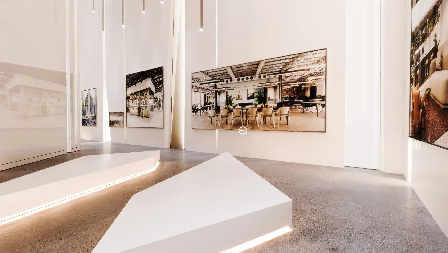
It is the entry experience of a digital commerce presence, built in 3D. In practice that means a designed space (a facade, a hall, a hero room) that carries the brand hard: signature materials, lighting, a few flagship products staged like a window display, and clear routes onward, whether those routes lead deeper into a 3D store or simply out to ordinary product pages. The storefront's job is recognition and desire, not stock-keeping. In the language of a physical retailer: the store sells, the storefront stops people on the pavement.
Virtual storefront vs virtual store: which do you need?
Ask what problem you are buying your way out of. If shoppers do not understand or remember your brand, you need a storefront: a smaller, sharper build whose whole budget goes into one memorable space. If your products are high-consideration and configurable (furniture, kitchens, design goods) and people hesitate because they cannot judge the product online, you need the whole virtual store, because the value is in inspecting products, not in the doorway. Storefront first is the common path: it is cheaper, it proves the concept on your own traffic, and it can grow a store behind it later without being rebuilt. Either way, here is how we scope a virtual showroom build.
What makes a virtual storefront actually work?
The same discipline as a good shop window. One idea, staged properly, beats ten products fighting for attention. The brand has to survive the journey into 3D: exact colours, real materials, lighting that matches the identity, because a storefront that feels generic is worse than none, it tells visitors the brand is generic too. And the routes onward have to be obvious within seconds; a beautiful space people bounce out of is a rendering exercise, not a storefront. We build these the way we build any brand space in CGI: the design is the client's identity, our job is to realise it faithfully and make it load fast on a phone.
What does a virtual storefront look like in practice?
Three recurring shapes. The window-display microsite: a single hero space for a launch or a season, linking out to normal product pages. The entry hall: the front layer of a full 3D store, the pattern Amazon Beyond uses for its branded LEGO and Samsung spaces. And the permanent flagship facade: a brand home that outlives campaigns, updated like a shop window rather than rebuilt. Platforms like Emperia and rooom rent templates for the first shape; the other two are usually custom work, owned by the brand.
How do you get one, and what does it cost?
The fork is the one that runs through this whole category. Rented, templated storefronts from SaaS platforms are quick and priced as subscriptions. A custom storefront is a smaller job than a full store, which makes it the affordable way into bespoke: the entry point sits well below a full build, and it grows into one if the numbers justify it. We build storefronts and full stores on the same stack, so nothing is thrown away when you scale up; the details are on our virtual storefront and showroom development page.
Frequently Asked Questions
Is a virtual storefront just a fancy landing page?
Functionally it competes for the same click, but it works differently: a landing page presents information, a storefront presents a place. For brands whose identity is spatial or material (retail, furniture, hospitality) the place version carries far more of the brand per second of attention.
Can a virtual storefront link to my existing e-commerce site?
Yes, and that is the standard first build: the storefront carries the brand moment and routes every product interaction to your existing pages and checkout. No replatforming involved.
How long does a virtual storefront take to build?
Rented templates are live in weeks. A custom storefront is a design-and-build project measured in weeks rather than the months a full store takes; the single space and limited product set keep the scope tight.
Sources
- Online shopping, Wikipedia (accessed 2026-07-07)
- Emperia, Emperia (accessed 2026-07-07)
- Babylon.js, Babylon.js (accessed 2026-07-07)