Project
Office · Abu Dhabi, UAE
The Iron Grid Hub: Making Concrete and Steel Feel Warm
Office & Creative Campus, Abu Dhabi, UAE
Overview
The Brief
An industrial office is the easiest brief to get wrong. Exposed concrete, black steel, ducts left on show: get the light slightly off and the whole thing reads like a car park with desks in it. The Iron Grid Hub, a creative campus in Abu Dhabi, was exactly that risk. The interior architecture practice behind it had a confident, raw scheme, and they needed renders that proved it would feel like somewhere people actually want to work.
That was the real job. Not "make pretty pictures of an office" but prove the warmth was already in the design, before anyone had poured a slab. In 16 years of office CGI I've watched plenty of brave material schemes die in the pitch room because the renders made them look cold.
32,500sq ft
Total Area
7
Renders Delivered
15
Days Turnaround
Won
Tender
The project
Making Concrete and Steel Feel Warm
An industrial office is the easiest brief to get wrong. Exposed concrete, black steel, ducts left on show: get the light slightly off and the whole thing reads like a car park with desks in it. The Iron Grid Hub, a creative campus in Abu Dhabi, was exactly that risk. The interior architecture practice behind it had a confident, raw scheme, and they needed renders that proved it would feel like somewhere people actually want to work.
That was the real job. Not "make pretty pictures of an office" but prove the warmth was already in the design, before anyone had poured a slab. In 16 years of office CGI I've watched plenty of brave material schemes die in the pitch room because the renders made them look cold.
The brief, in plain terms
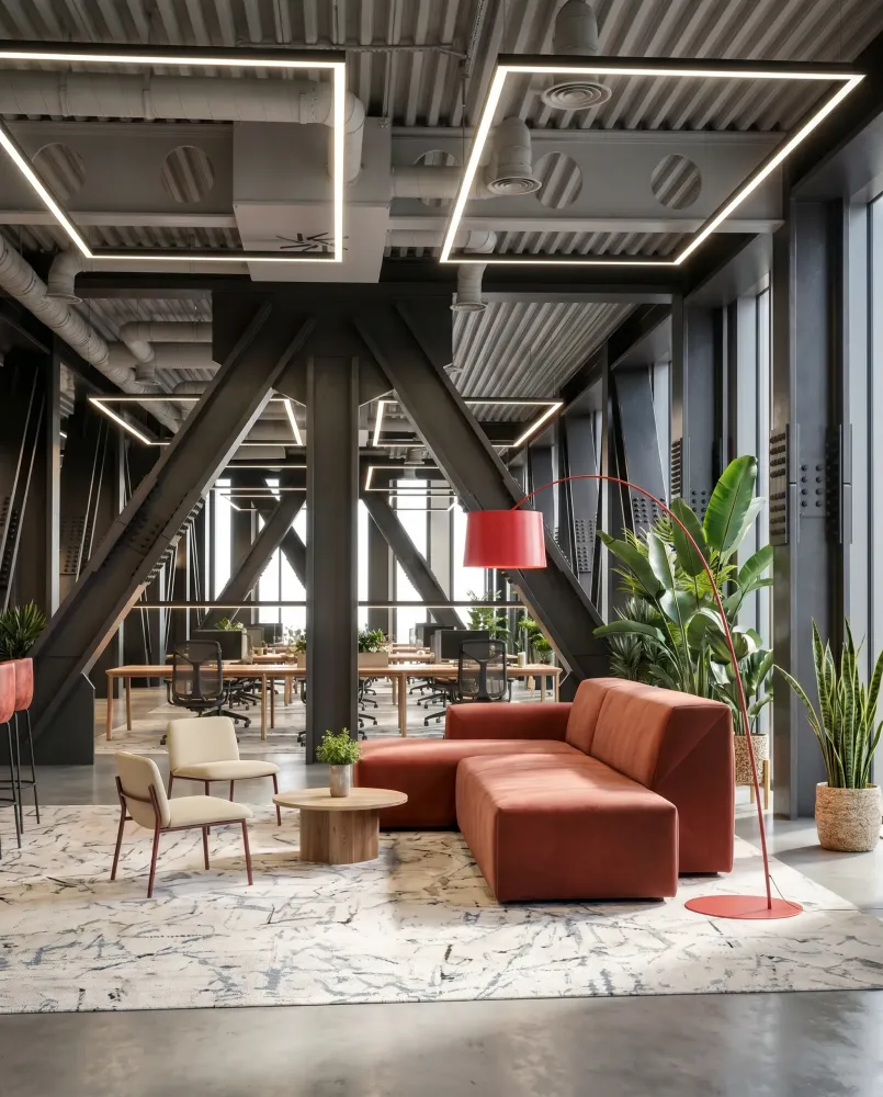
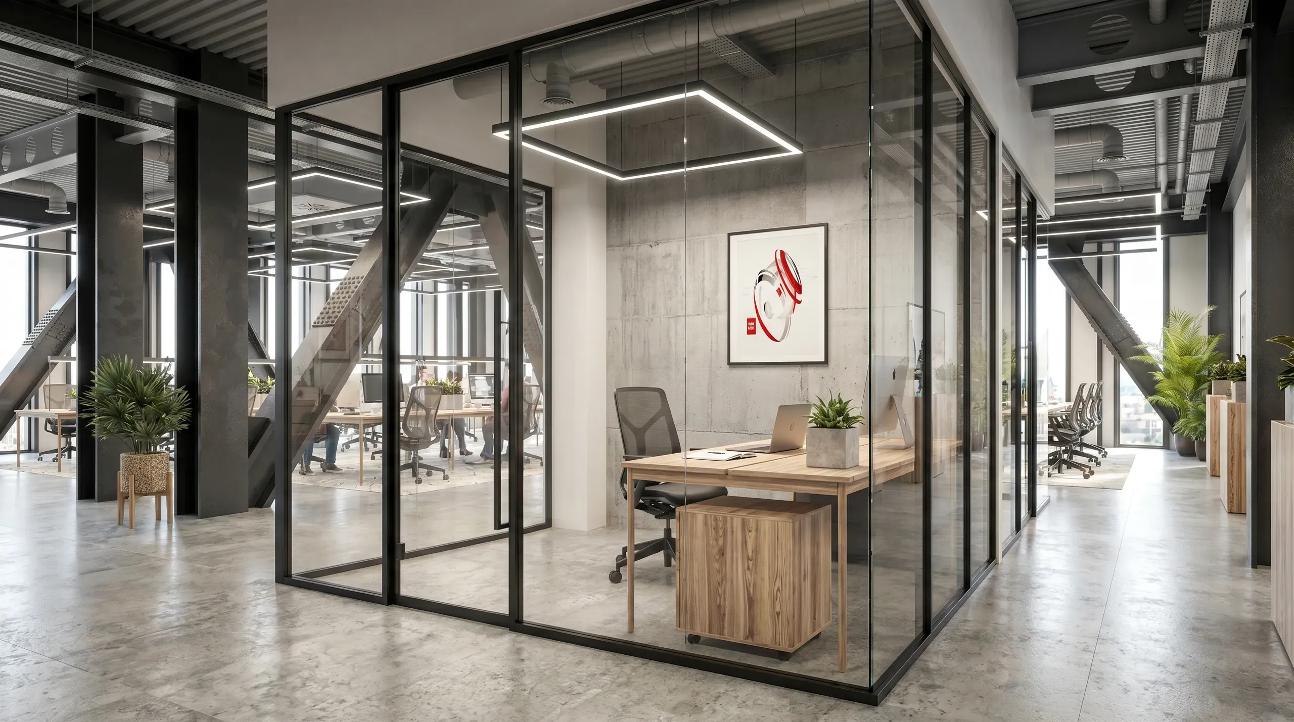
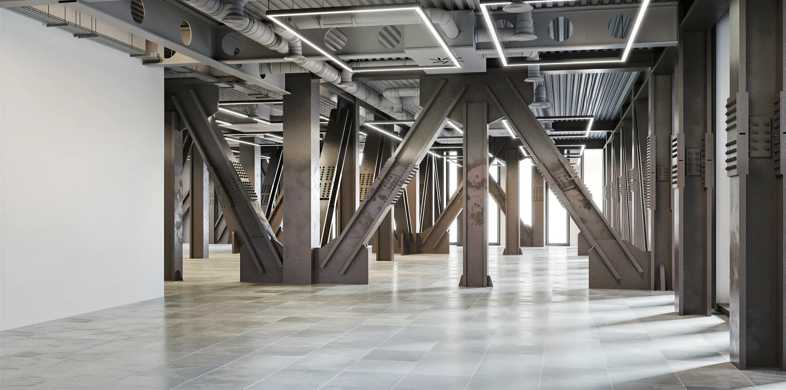
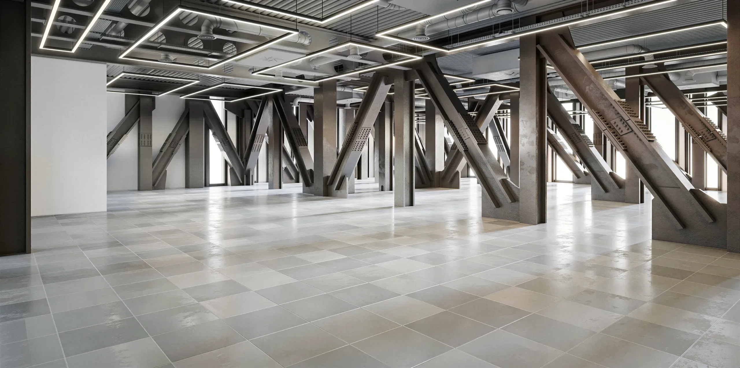
This building is one big open structure: concrete walls, massive black steel columns, visible ceiling pipes. None of it is hidden. The question a client always asks at this point is the honest one. Won't it feel cold? In a desert climate, where the instinct is to shut the heat out, an interior that looks hard and grey is a tough sell to the people signing off the fit-out.
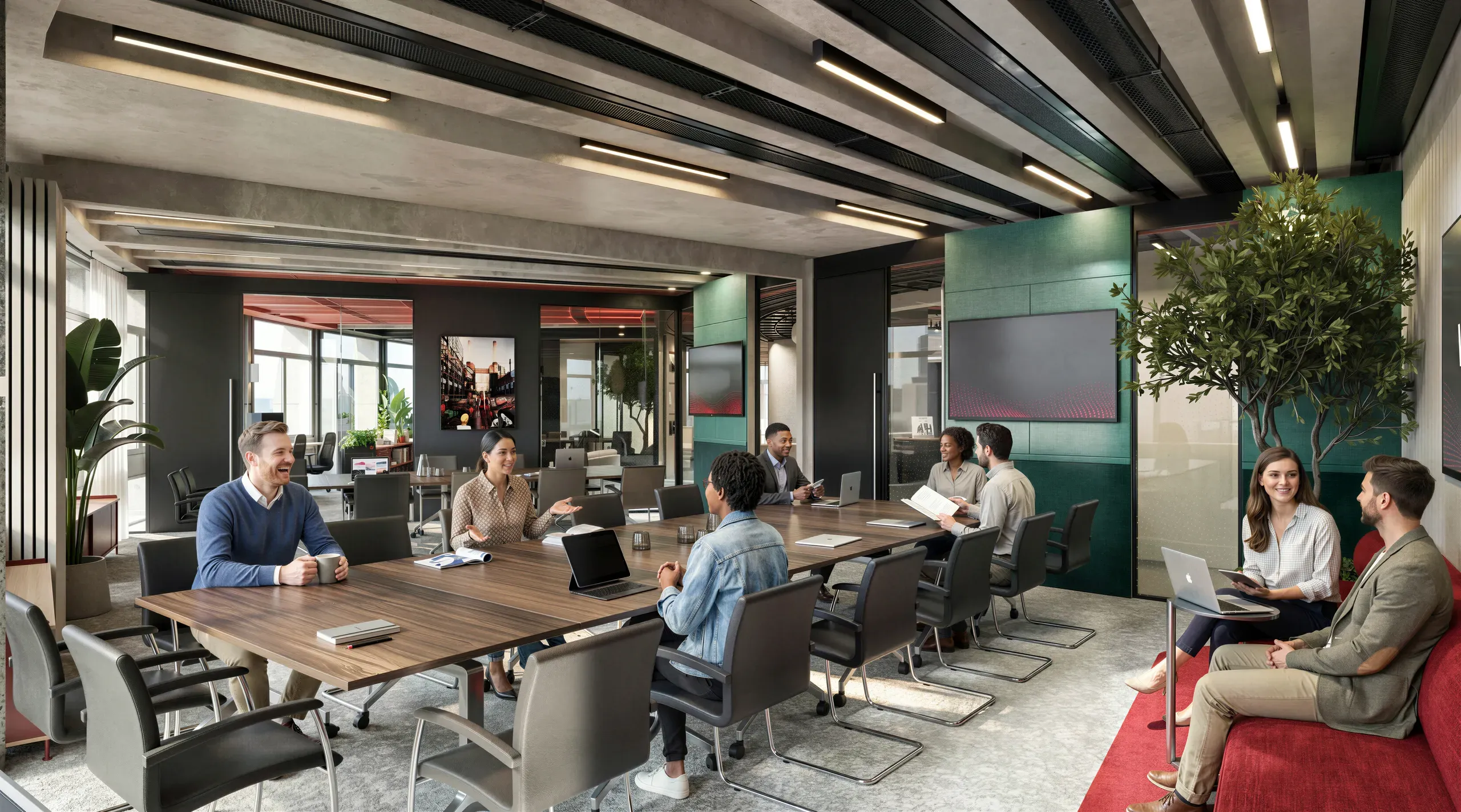
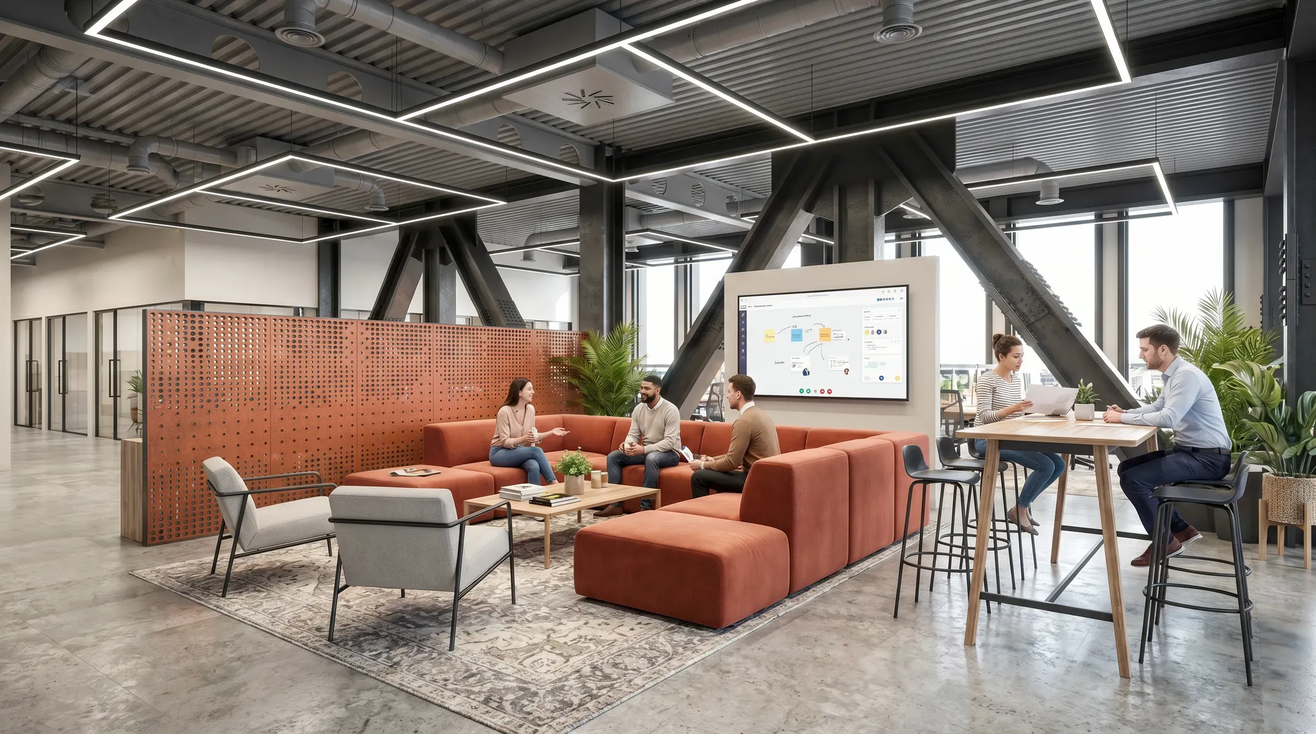
So we built the case for the opposite. This scheme leans on 3 moves to break up the concrete, and our brief was to make all 3 legible in a still image.
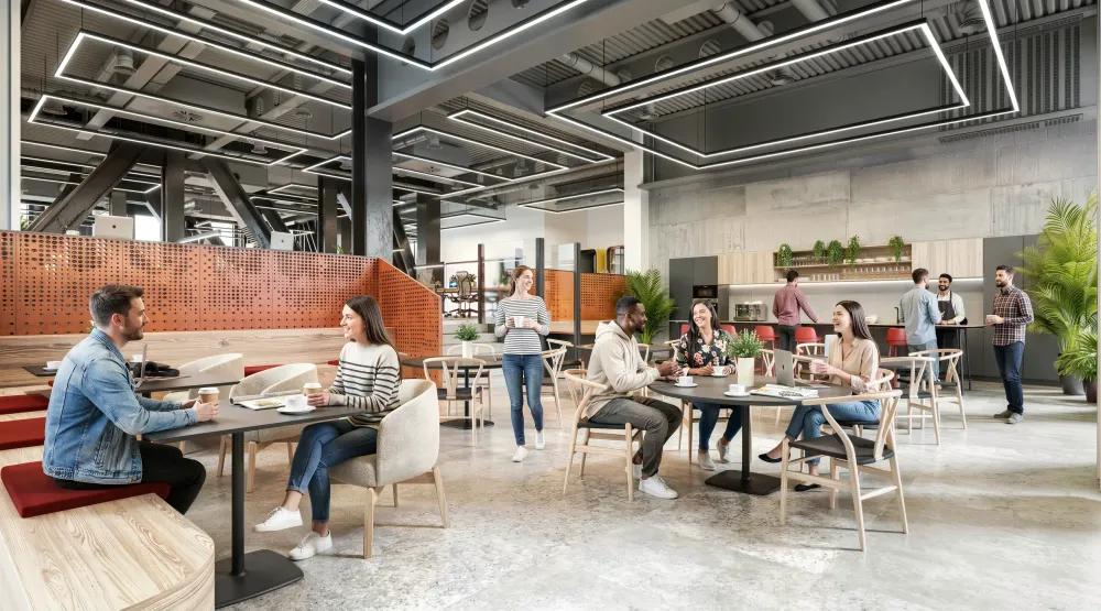
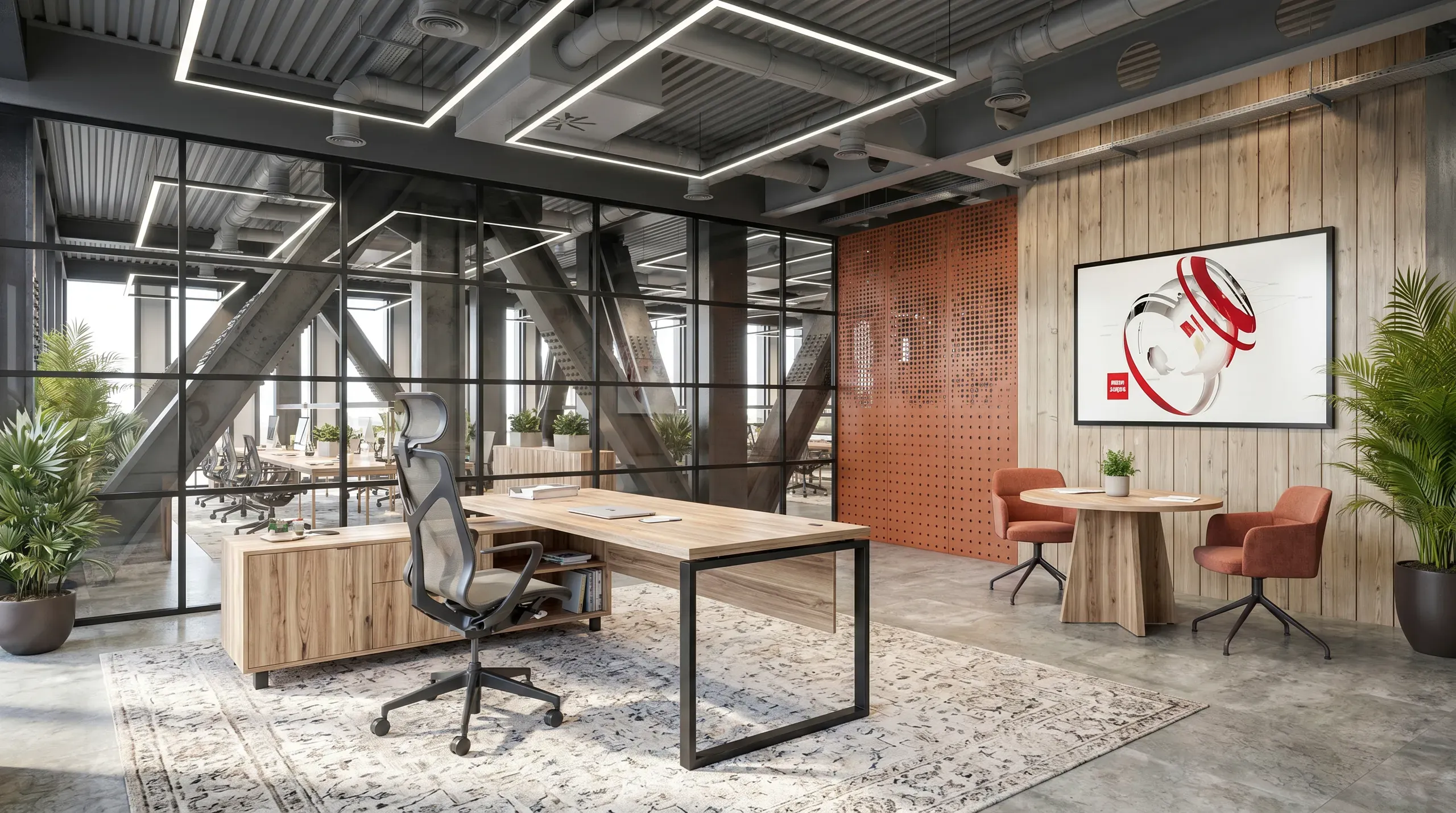
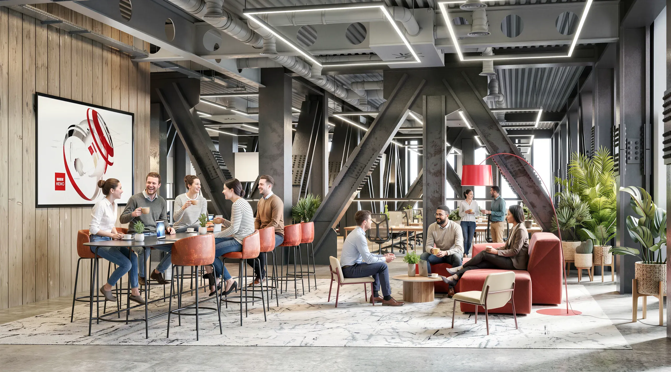
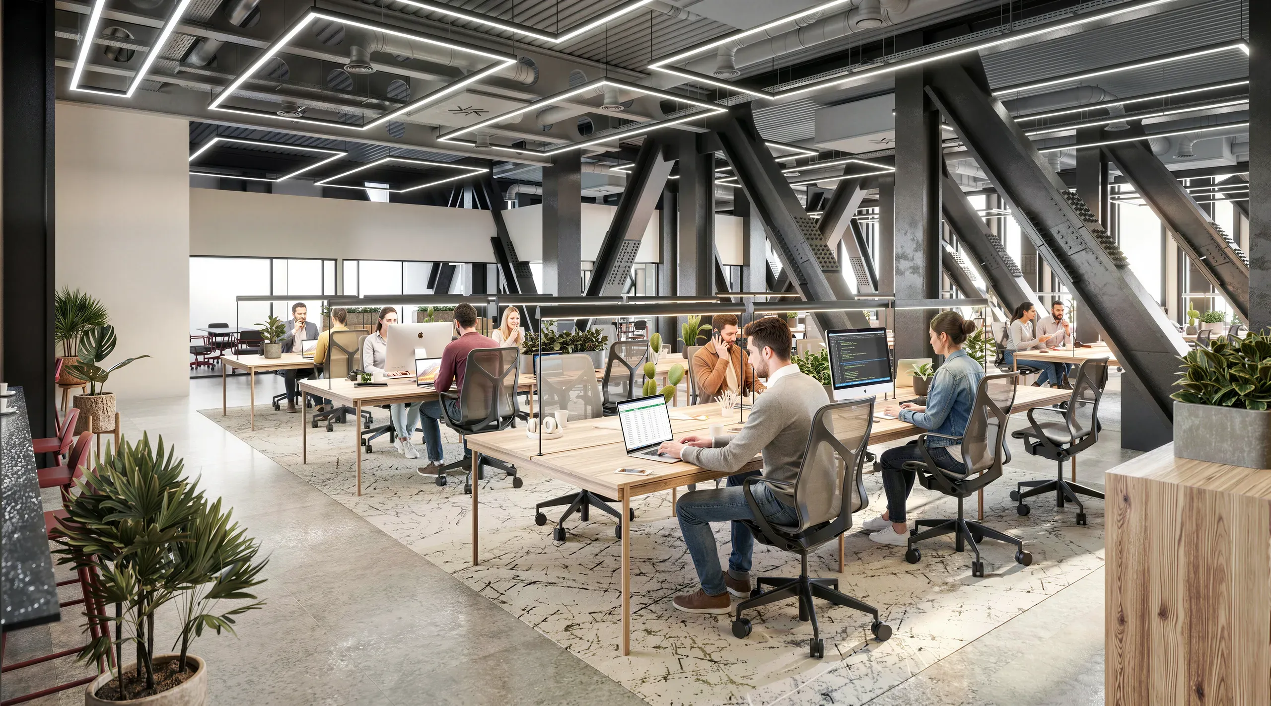
First, the staircase. A full-height run wrapped in orange-brown perforated steel sits dead centre, and that one colour does most of the heavy lifting against the cool grey. It had to read as warm metal catching light, not as a flat orange shape. Second, the planting: trailing greenery off the lobby globes, ivy strung through a grid of timber ceiling beams at the back. Third, the floor changes underfoot, from poured concrete on the main routes to light oak in a chevron through the quiet zones, then textured grey carpet in the lounges. On a plan that's a note. In a render it has to be a surface you can almost feel.
How we lit it
We modelled the whole volume in 3ds Max and lit it in Corona. Lighting was the entire game here.
Abu Dhabi sun is brutal and direct. Left raw, it blows out the glazing and kills every material behind it: concrete goes chalk-white, the orange stair goes neon, planting reads plastic. This design already answered the problem with architectural shading at the windows, so we rendered that working. Light comes in diffused and soft, enough to show the polished concrete floor without scorching it. Indoors we layered the warmth back in with the square LED frames over the desks, the white globe lights hung at 3 different heights in the lobby, and the leaf-shaped pendants over the long ash table.
I'll be straight about one thing I leaned on. I pushed the orange stair's warmth slightly in the grade, because on a screen perforated steel loses depth fast and goes muddy. On the build it'll sit a touch cooler. That's a judgement call, not a trick, but if you're commissioning industrial renders, ask the studio where they've nudged the colour. Everyone does it, and the honest ones will tell you.
The spaces that sell the room
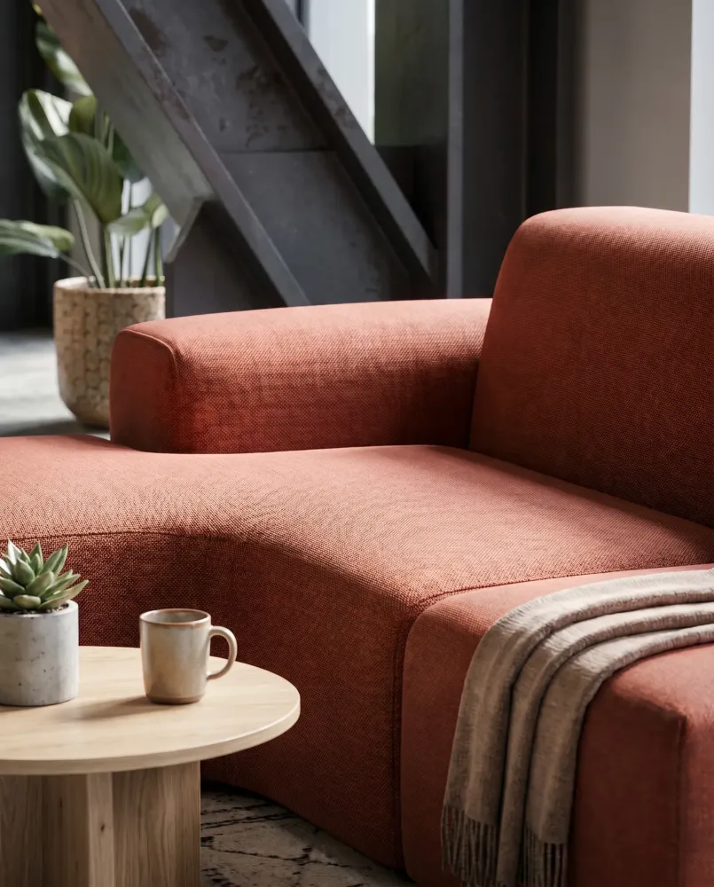
A few zones carry the argument. Reception sets the tone: a dark marble desk against light vertical wood slats, the orange stair rising right beside it, daylight raking across the concrete. Open work areas pair long oak desks with black task chairs, split by timber planters full of greenery so the floor never reads as one flat grid. The social heart is a cluster, not a canteen, built around a long ash table under those leaf pendants, a deep-green coffee bar against a dark blue wall, and brown leather armchairs on patterned rugs.
A breakout zone at the back is where the scheme stops being careful. One wall is a huge abstract mural in orange, peach and blue. Green chairs sit around small round tables, and the timber ceiling grid holds hanging ivy. We gave that area the most colour saturation in the set on purpose. It's the shot that tells a nervous client the office has a personality, not just a finish schedule.
Why it worked
These renders did the one thing the design needed them to do. They showed that concrete and steel can hold warmth when the light, colour and planting are handled properly. A heavy industrial shell turned into somewhere bright and friendly, on screen, months before the first delivery turned up on site. That's the point of this kind of CGI. It lets a client back a brave material decision with their eyes, not just their imagination. Across 389 projects, that's the moment we're really being paid for.
01 / 07


Your project next
Ready to visualize yours?
Talk through your project on WhatsApp, or see exactly what it costs below.